
Not Chicken is a bold, personality-driven vegan fried chicken concept that blends humor with purpose. Inspired by the loud, confident tone of modern hot chicken branding, the voice is playful, slightly irreverent, and highly memorable. The brand leans into absurdity to challenge expectations—proving that plant-based fried “chicken” can deliver the same craveable experience without compromise.
The tagline, “Still Cluckin’ Delicious,” reinforces this idea by combining humor with a clear message: you’re not missing out by going vegan. Instead, you're gaining something just as satisfying—without the harm. Not Chicken positions itself as both a fun dining experience and a subtle push toward more conscious eating.
〰️
〰️
〰️ 〰️
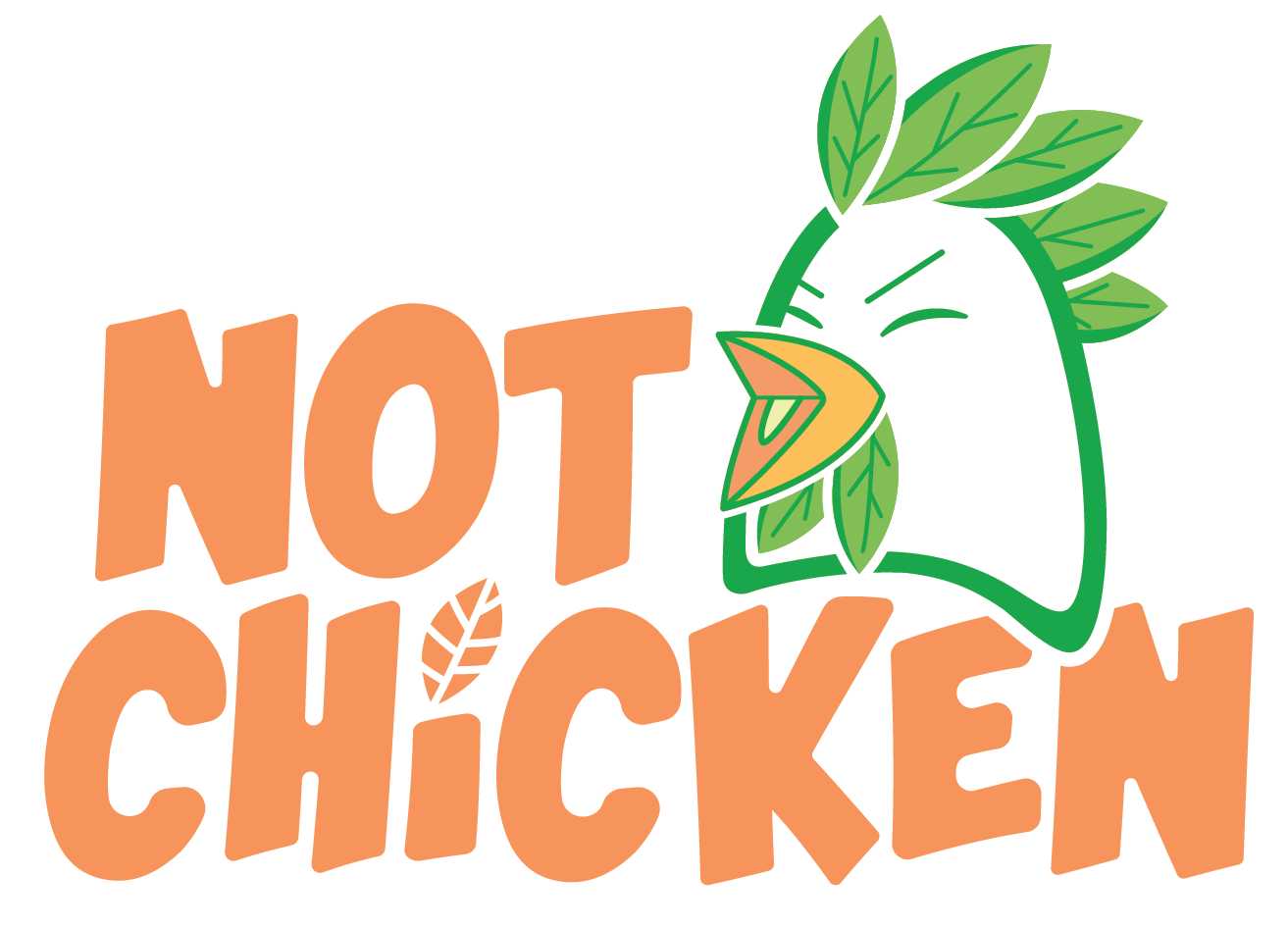
The Not Chicken logo is built around a bold, sans-serif wordmark that emphasizes clarity, confidence, and modern appeal. The playful twist comes through in the details: the dot of the “i” is replaced with a leaf, immediately signaling the plant-based identity of the brand.
Centered within the typography is a cartoon-style chicken head, depicted laughing. Rather than traditional feathers, the chicken is composed of layered leaves, reinforcing the vegan concept in a visually engaging way. This character adds personality and helps humanize the brand, making it approachable and memorable. The chicken’s expression—happy and carefree—suggests a positive, ethical shift rather than sacrifice.
Two logo variations were developed to ensure versatility across applications, allowing the branding to adapt seamlessly to different formats such as packaging, apparel, and digital use.
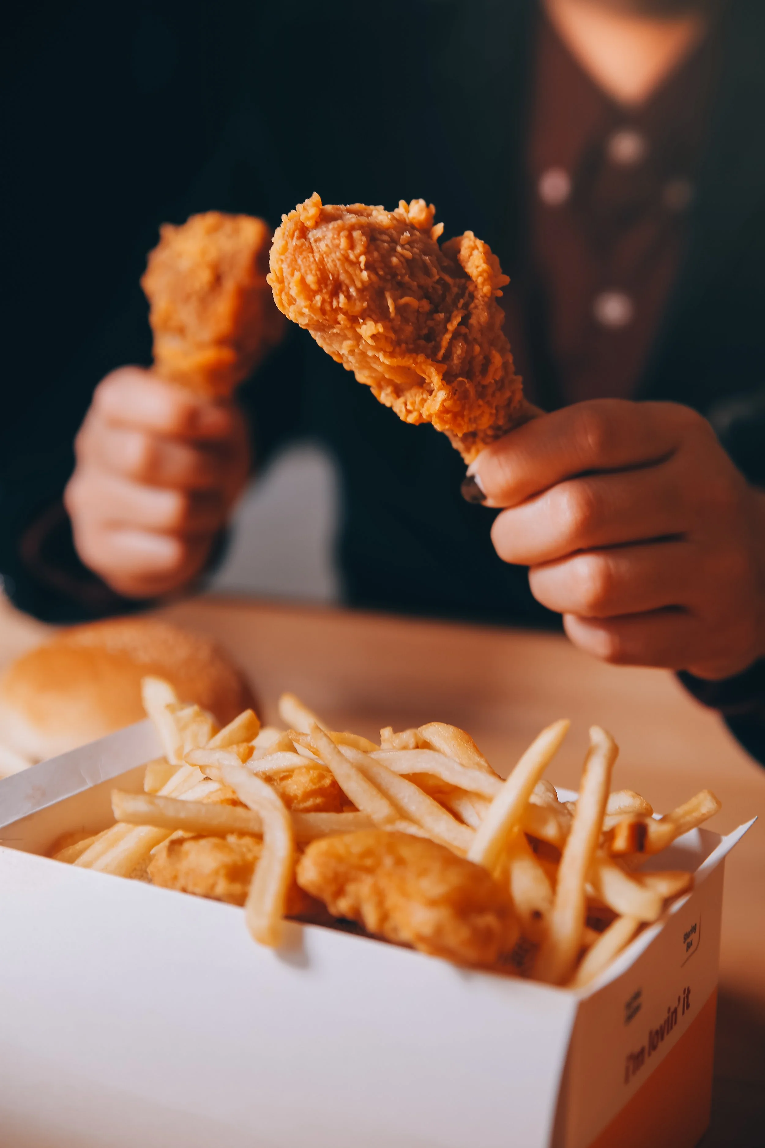
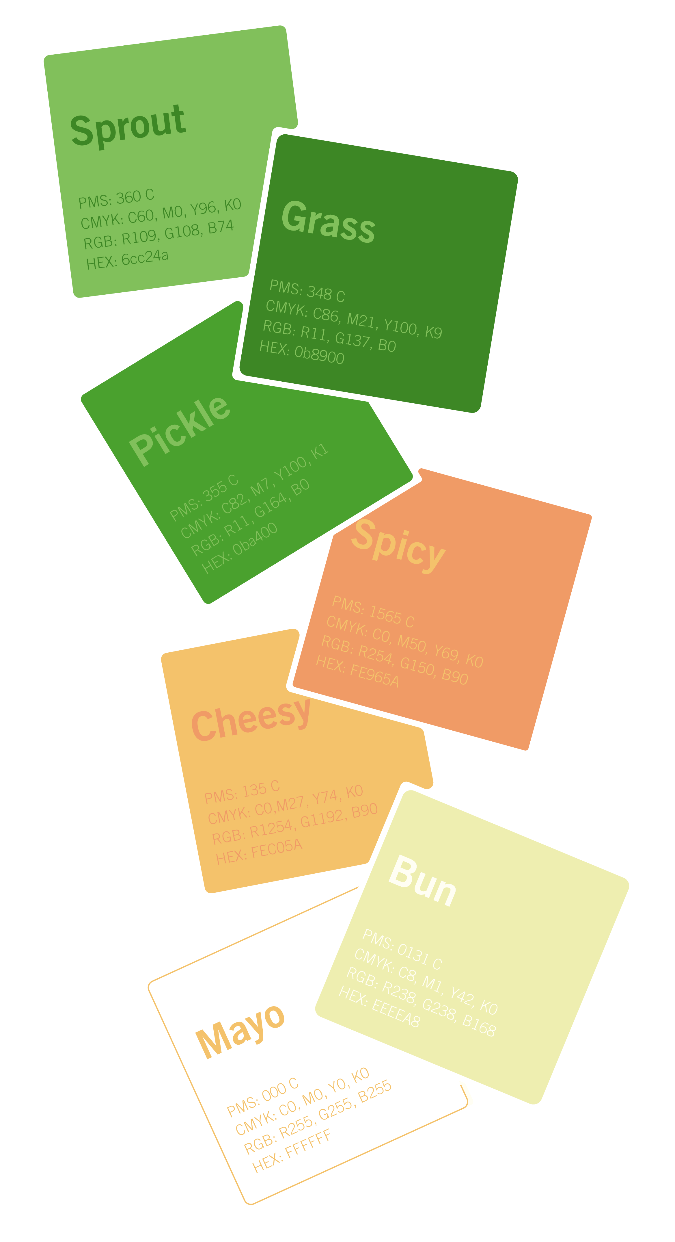
The color palette is rooted in vibrant greens, supported by warm orange accents. The greens reinforce freshness, plant-based ingredients, and sustainability, while the orange adds energy, warmth, and a subtle nod to traditional fried food visuals.
Each color is defined using PMS, CMYK, RGB, and HEX values to ensure consistency across all mediums. PMS (Pantone Matching System) is essential for accurate color reproduction in physical printing, while CMYK is used for standard print processes. RGB and HEX values ensure colors appear consistently across digital platforms. Including all four formats allows the brand to maintain visual integrity whether it’s printed on packaging, displayed on a screen, or used in promotional materials.
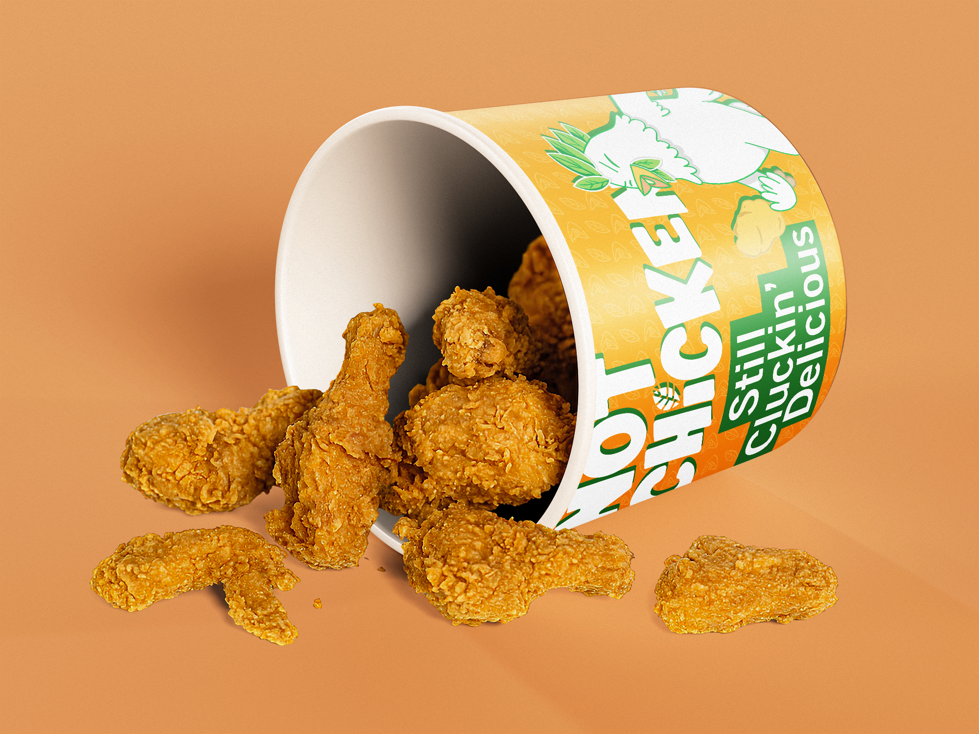
The packaging design expands the brand identity through the use of a custom repeating pattern that adds texture and visual interest. This pattern incorporates elements from the logo—specifically the leaf shapes and the chicken’s beak—creating a cohesive system that reinforces brand recognition.
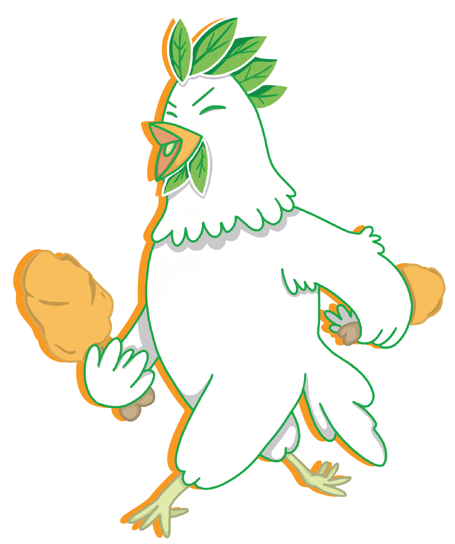
In addition to the pattern, an illustrated full-body version of the chicken character appears on the packaging. This version shows the chicken walking confidently while holding drumsticks, further leaning into the brand’s humor and irony. The juxtaposition of a chicken enjoying plant-based “chicken” enhances the playful tone while subtly reinforcing the ethical message.
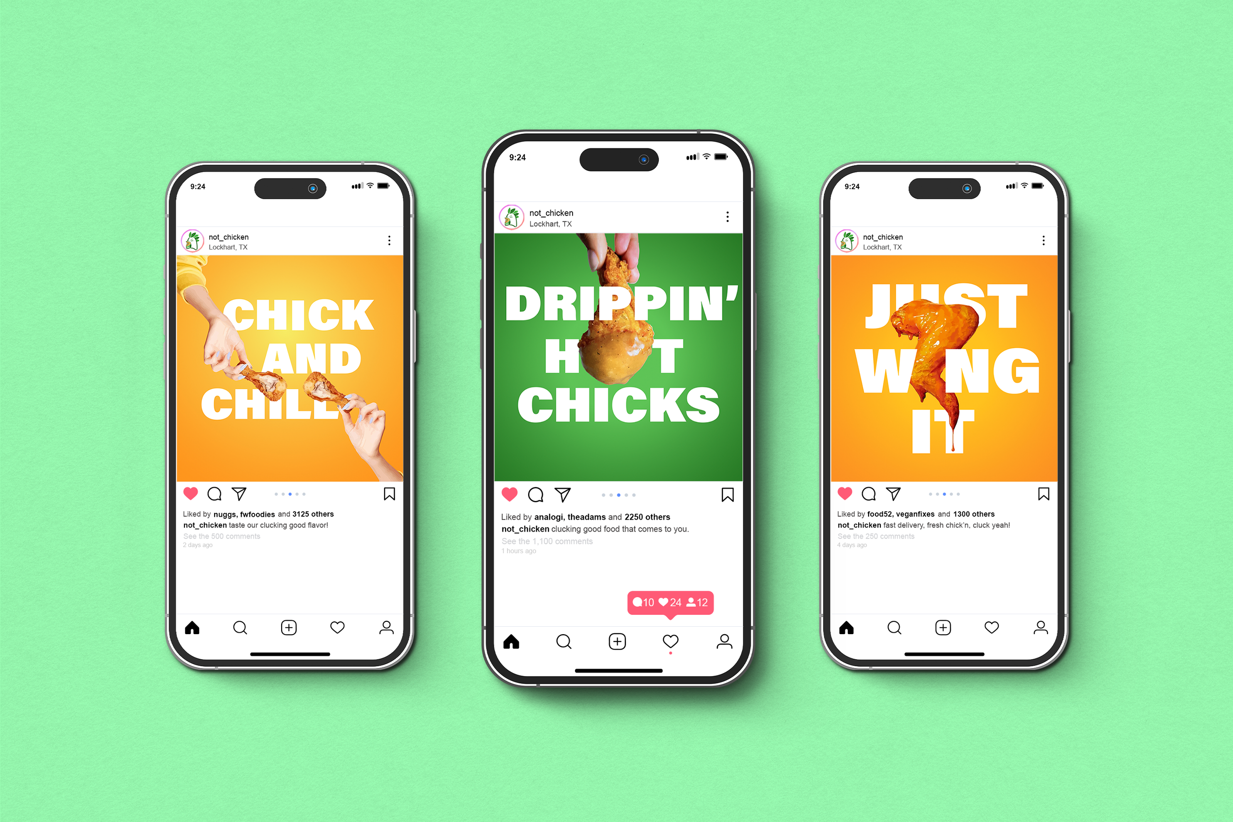
The Instagram campaign is designed to be bold, immediate, and visually engaging. Typography and imagery work together, with food elements interacting directly with the text to create moments that catch attention and encourage users to pause while scrolling.
A consistent typeface, color palette, and subtle center lighting keep the posts cohesive and recognizable, while short, playful phrases reinforce the brand’s voice. Each post feels dynamic and fresh, but still clearly part of a unified system.
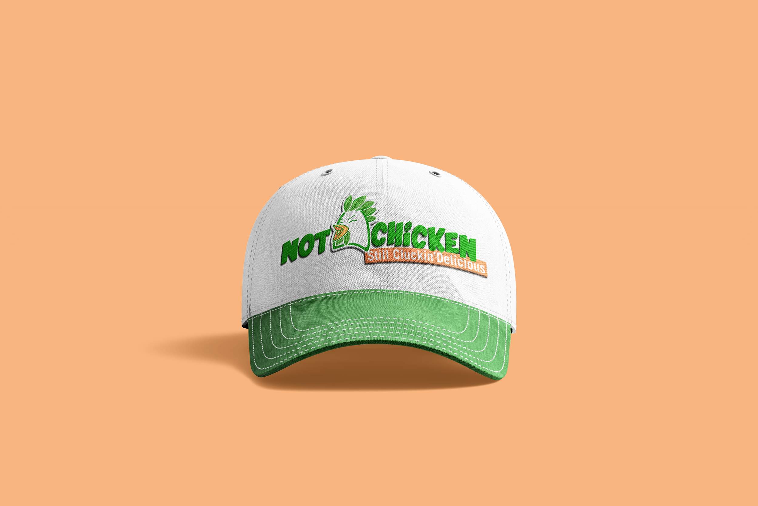
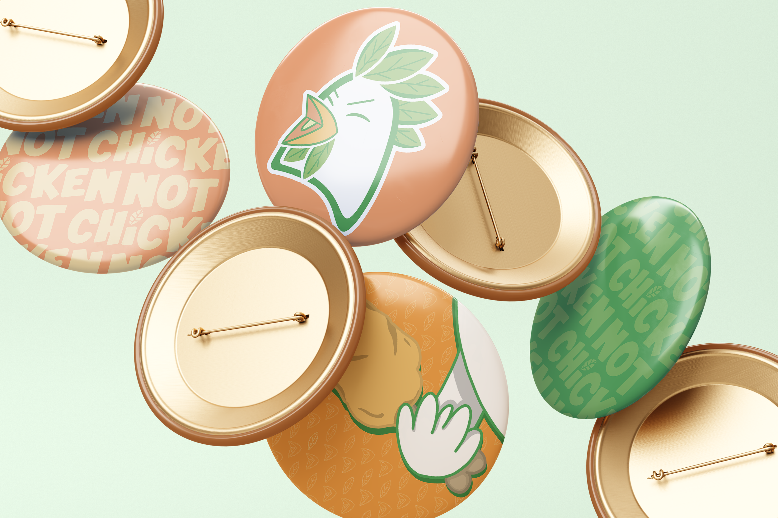
The baseball cap and pins works through simplicity and clarity. By using clean color combinations pulled directly from the brand palette and for the cap a single, vertically oriented logo, the design feels intentional without being over designed.
This minimal approach makes the branding easily recognizable at a distance while keeping everything versatile and wearable. It functions not just as merchandise, but as an extension of the brand’s identity into everyday style.