NORM is an alternative techwear brand that challenges societal expectations through expressive, non-binary design. Rooted in grunge aesthetics and functional construction, the brand blends durability with individuality. NORM embraces contradiction—its name suggests conformity, yet its identity rejects it entirely. Each design prioritizes comfort, utility, and self-expression, encouraging wearers to exist outside of imposed norms.
NORM BRAND GUIDELINES
-
![]()
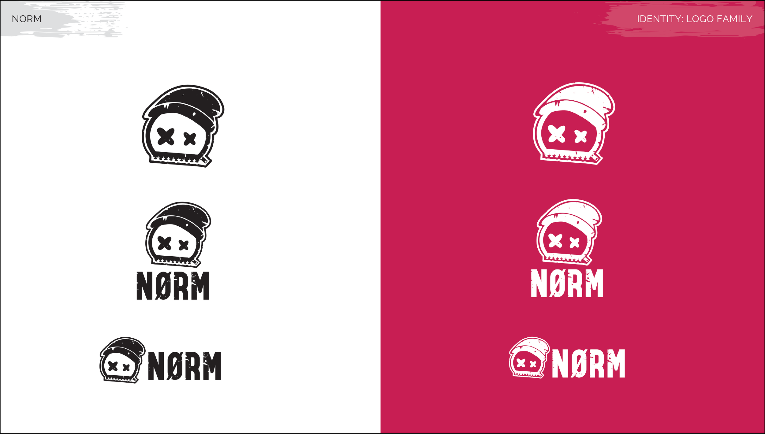
The NORM logo combines textured linework with symbolic elements—X eyes, a zipper mouth, and a slashed “O”—to challenge the idea of “normal.” The zipper and beanie subtly reference apparel, reinforcing the brand’s focus on clothing, while the stylized head and gritty aesthetic reflect its anti-conformist identity and roots in alternative, non-binary fashion.
-
![]()
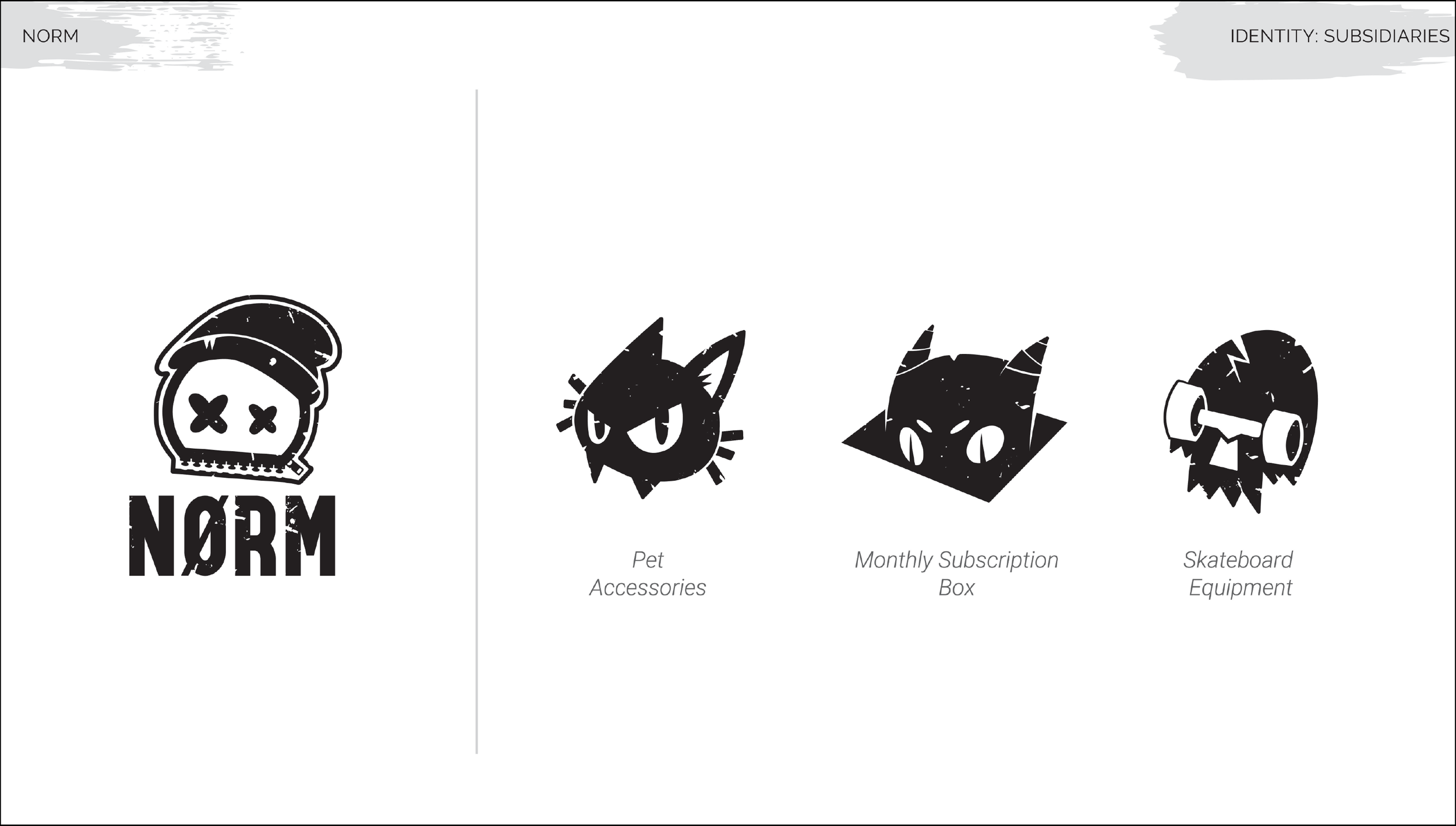
Each subsidiary logo builds on NORM’s core visual language through bold linework, texture, and expressive iconography. While each mark introduces a distinct personality, they remain visually cohesive, extending the brand’s rebellious tone across multiple product categories.
-
![]()
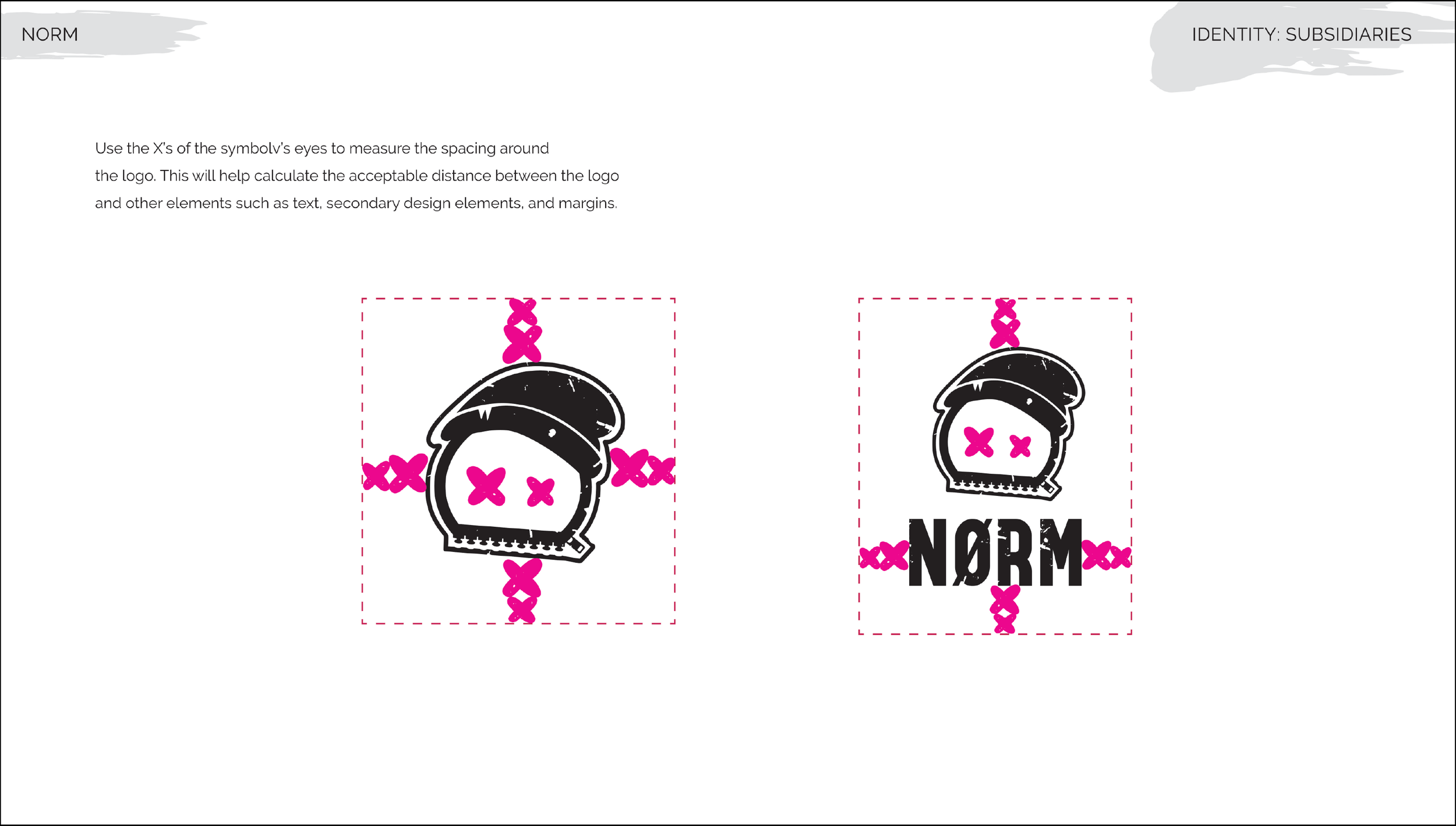
The X-shaped eyes within the logo are used as a built-in measurement system to define clear space. This “invisible border” ensures consistent spacing between the logo and surrounding elements such as text, graphics, and margins, preserving legibility and visual impact across all applications.
-
![]()
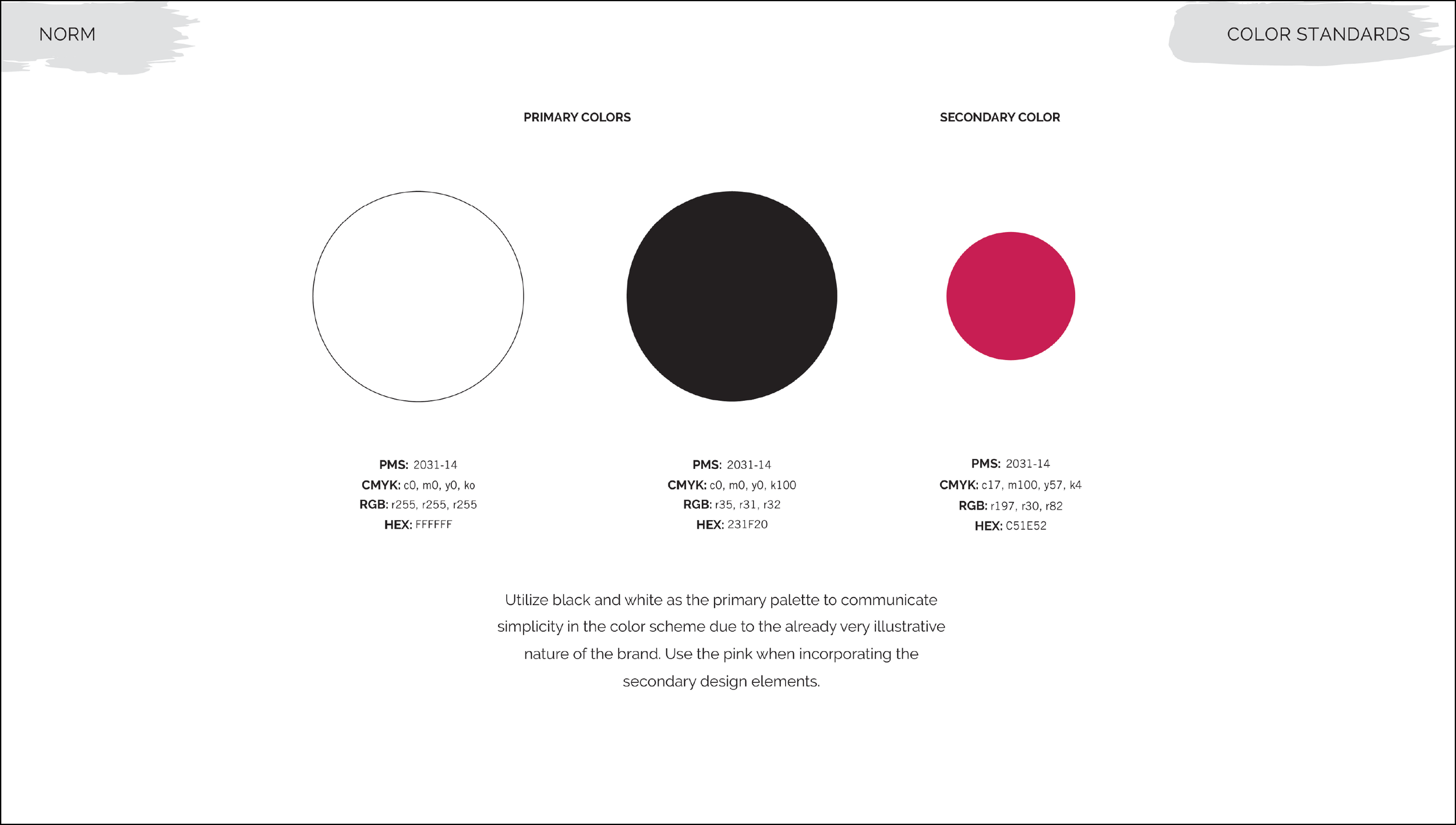
NORM’s primary palette consists of black and white, creating a minimal foundation that balances the brand’s highly illustrative style. A bold pink is used as a secondary accent color, applied to graphic elements to add contrast, energy, and visual consistency across touchpoints.
-
![]()
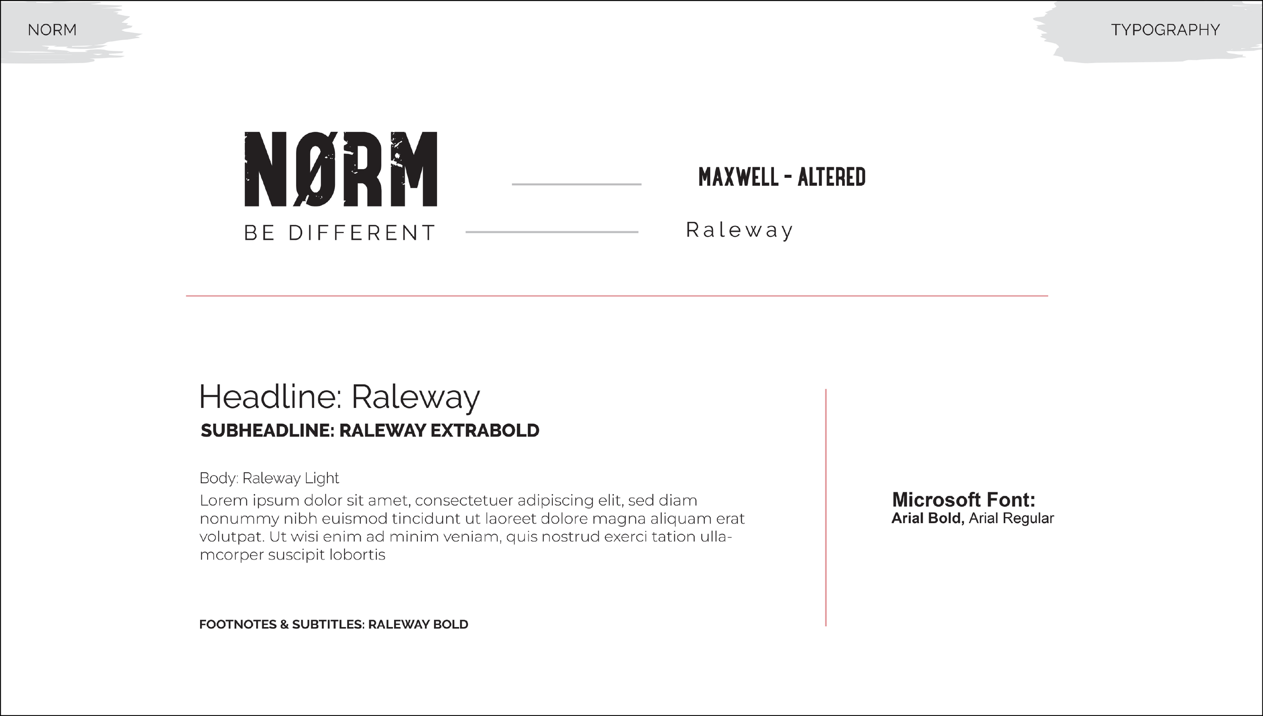
The NORM letterhead is derived from the font Maxwell, customized to create a more distinct and expressive wordmark. The tagline “BE DIFFERENT” is set in Raleway, which also serves as the primary type family across the brand. Various weights of Raleway are used to establish hierarchy for headlines, subheadlines, body text, and captions, with Arial Bold and Arial Regular as accessible alternatives.
-
![]()
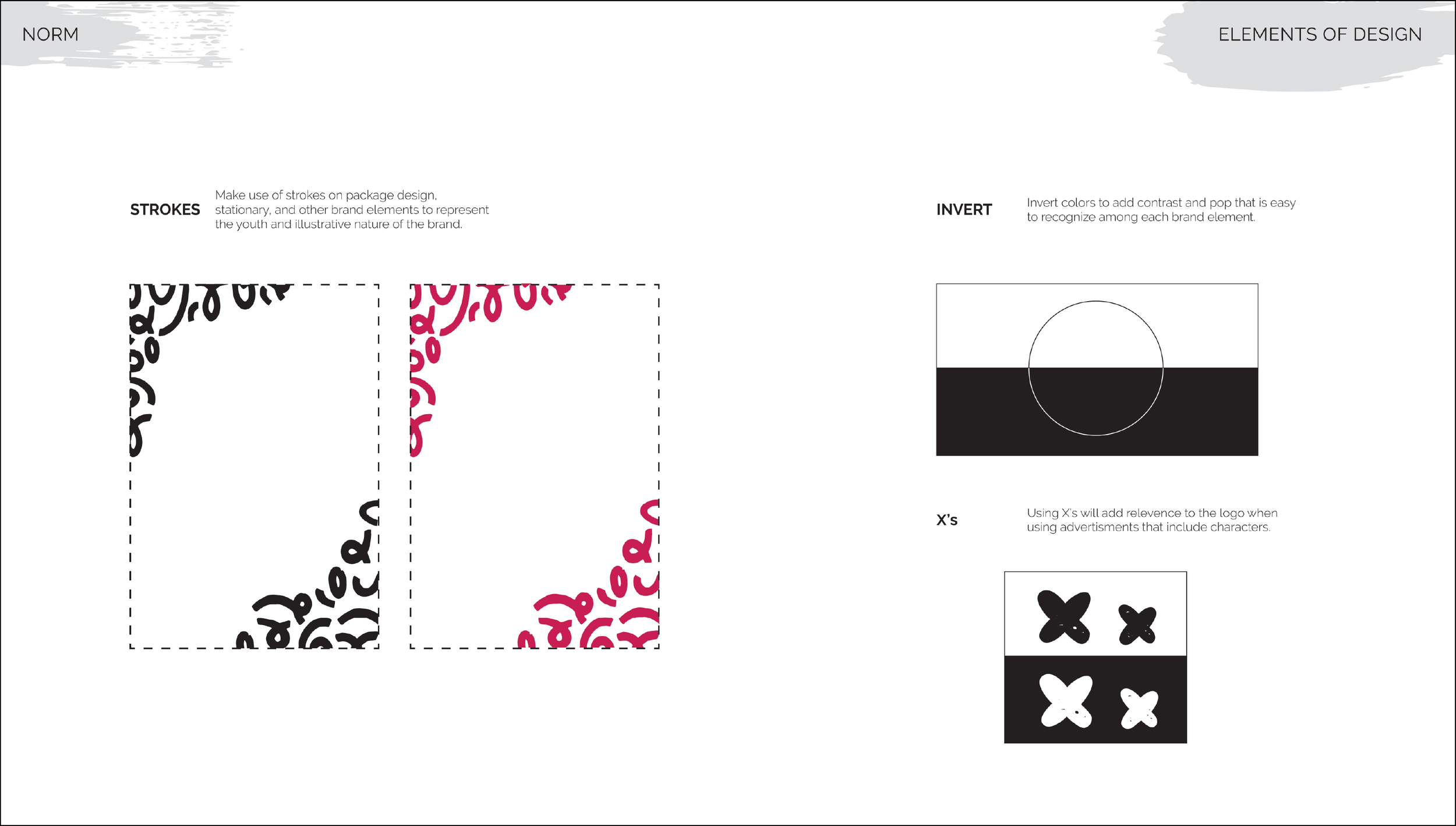
NORM’s visual system incorporates expressive strokes, often used in packaging and stationery to emphasize the brand’s youthful, illustrative nature. Color inversion is applied to create high-contrast moments that stand out across applications. The recurring use of X motifs reinforces the logo’s identity, especially within character-driven visuals and promotional materials.
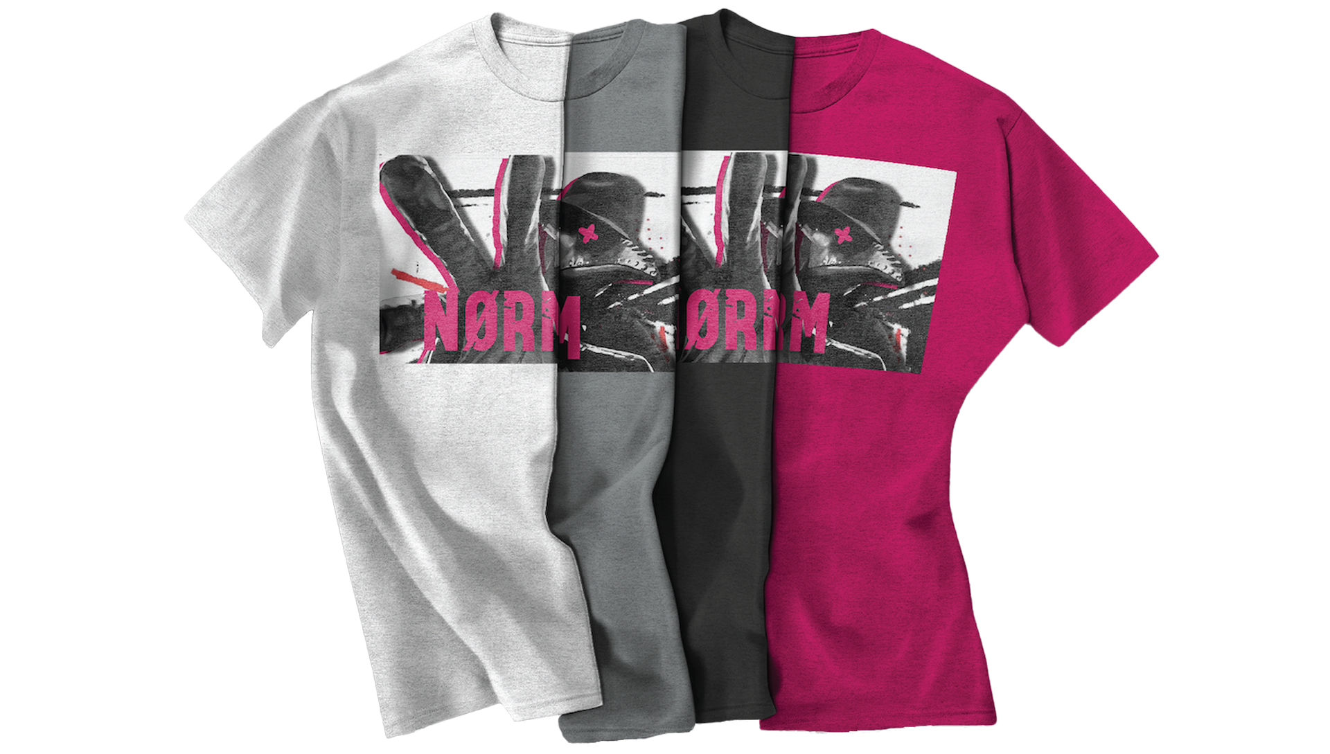
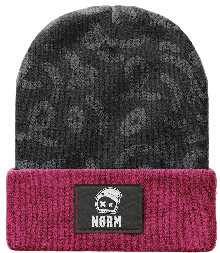
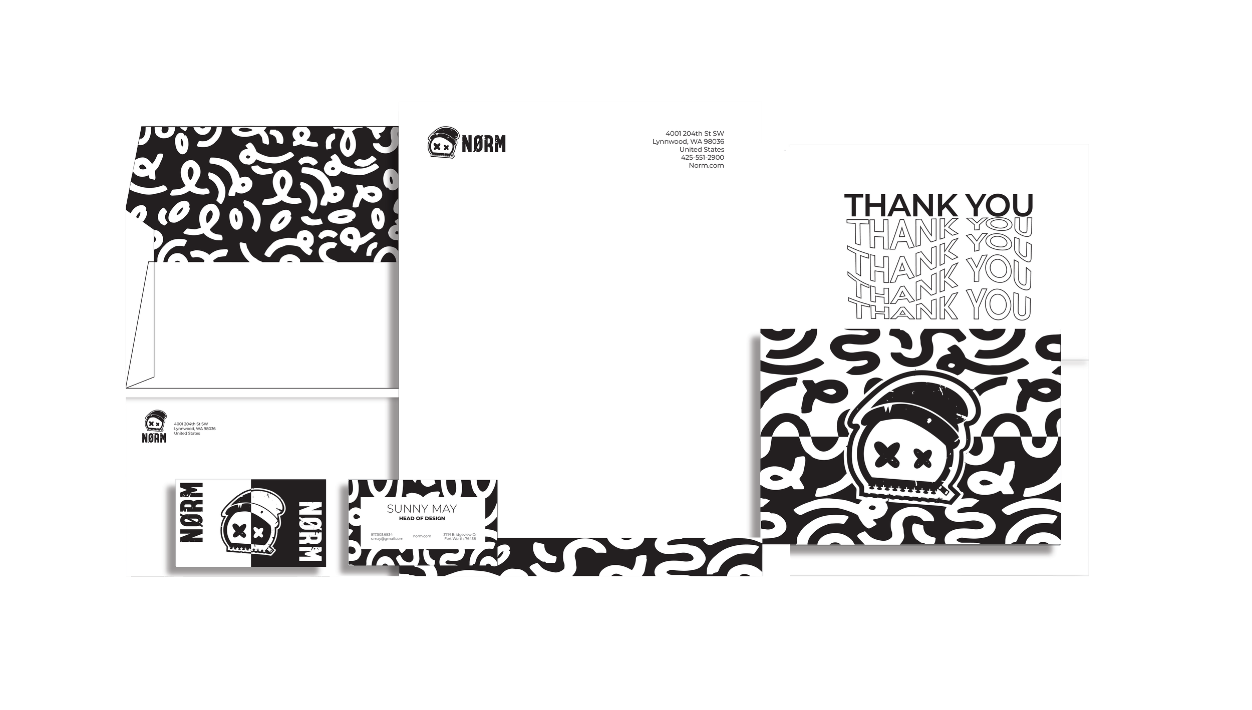
BRANDED ELEMENTS
These branded elements showcase how the NORM identity translates across both physical touchpoints and wearable products. From stationery to apparel, consistent use of texture, typography, and iconography reinforces brand recognition while maintaining the raw, alternative tone. The range highlights both expressive applications and more minimal pieces, demonstrating the brand’s versatility across different formats.
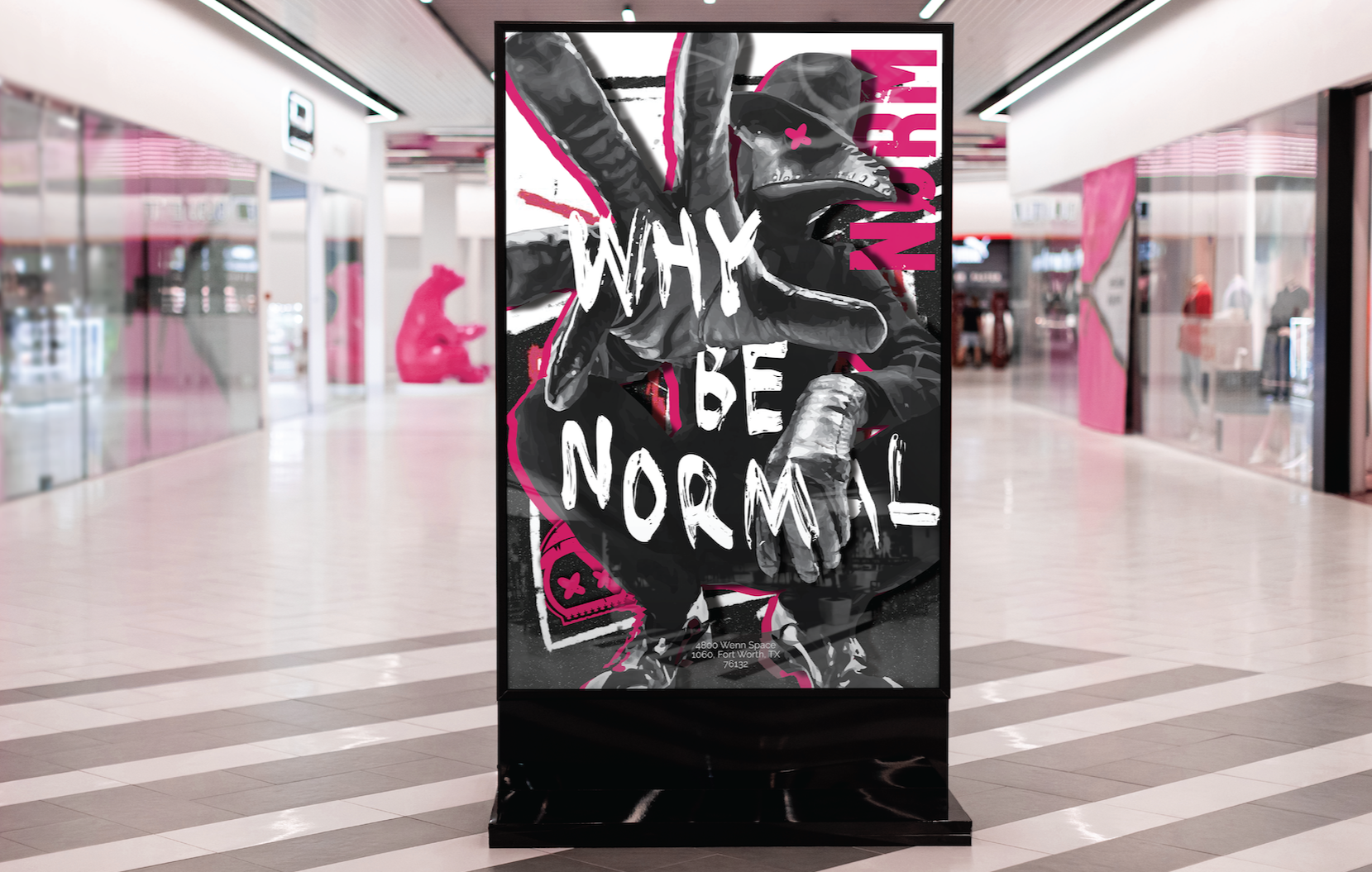
POSTER DESIGN
The “WHY BE NORMAL” poster acts as a visual manifesto for the brand. A chaotic composition layered with hidden elements invites viewers to engage more deeply, rewarding closer inspection with embedded brand details such as the logo and letterforms.
The introduction of the plague doctor character adds narrative depth, symbolizing mystery, rebellion, and a rejection of societal expectations. This figure begins to establish itself as a recurring brand icon, expanding NORM beyond a clothing label into a storytelling experience.
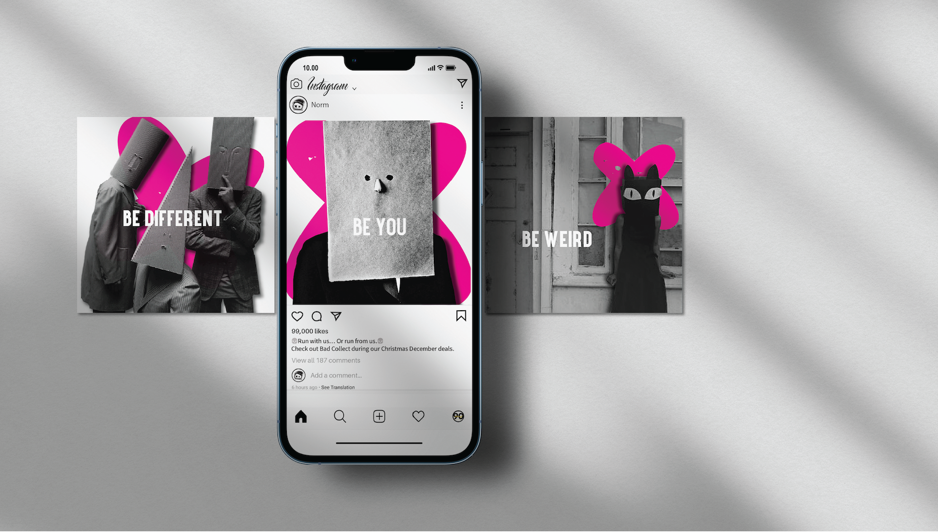
SOCIAL MEDIA CAMPAIGN
This Instagram campaign focuses on identity and self-expression through a bold, repeatable message: “BE DIFFERENT,” “BE YOU,” and “BE WEIRD.” Each visual features obscured or altered faces using unconventional materials, reinforcing the rejection of societal labels.
The addition of oversized pink X’s—directly referencing the logo—creates a strong visual motif that ties the campaign back to the brand identity. The consistent color usage and surreal compositions establish a recognizable and impactful social presence.